 Visit our US Store
 Visit our Canadian Store
 US Customers
Sometimes, food label design isn’t about being the most modern-looking and edgy brand on the shelf. Sometimes, history and comfort are what customers are craving as they walk the aisles. Figuring out which approach your brand should take is an important step when redesigning your labels. Having a strong identity in mind means you’re less likely to. End up with a muddled look that confuses customers.
Classic Looks, Modern Labels
Design Week profiled the recent rebranding undertaken by Hellmann’s mayonnaise, providing a great example of a company embracing a simplified and “authentic” look to make an impression on its customers.
In this case, designers decided that the current Hellmann’s label is too bright and synthetic. Consumers today may be leery of purchasing such a product, due to worries that. The look is somehow synonymous with artificial or processed ingredients.
To counter such a perception, Hellmann’s decided to implement a callback to its roots. Design Week noted that the brand began over 100 years ago as a New York Deli. Going to a hand-drawn label look and an old-fashioned custom typeface could bring consumers back to a time that evokes simple and wholesome recipes. The thought behind the “deli” look extended to numerous elements of the design – the backdrop of the label was colored and shaped to look like a deli ticket.
Packaging Europe pointed to a similar attempt to evoke the past by Ambrosia custards and puddings. The company is actually celebrating its centennial with a limited-release label based on its first look from 1917. This means flat colors instead of a modern look and typefaces that evoke the past. Of course, the new label isn’t an exact recreation. It also has plenty of subtly applie branding referring to the centennial.
Young Brands that Evoke History
Your brand likely has a good deal less than 100 years of history behind it, but you can still learn from the centennial companies above. There are very few consumers alive today who remember what those packages look like in the 1910s. Which means the producers are making a play for the idea of nostalgia, not the real thing. You can try the same tactic through classy, simplified palates and designs that win the hearts of shoppers looking for natural, wholesome foods.
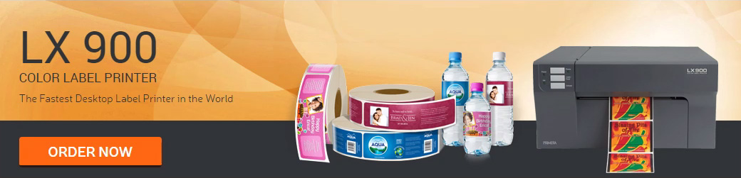
When it’s time to handle a refresh of your food labeling strategy, whether you’re going for a look that evokes a past century or a cutting-edge design sense, Argon’s printer offerings can bring the process in-house. Check out our U.S. site or our Canadian page.
 US Customers
 Follow us on facebook
 Follow us on twitter
 Follow us on linkedin
 Follow us on youtube
 Follow us on google+
 Pinterest
Leave a Reply