 Visit our US Store
 Visit our Canadian Store
 US Customers
Label design is an important part of product marketing, but particularly so for food labeling. Your label needs to relay information about the product to the customer while looking fresh and appetizing. Here are some food label mistakes to avoid:
- Too many fonts. Most software comes with a huge library of fonts. This give you more choices in picking the font that’s right for your product. The problem is that some manufacturers choose too many fonts for a specific product. This can look confusing an unattractive to a customer who wants to learn more about the product. Stick to one or two fonts that complement each other and are easy to read.
- Brand name size. After being drawn in by the picture of the food item, the first thing that you want customers to notice is the name. If it’s too small it may be illegible or go unnoticed. If it’s too big it may crowd the rest of the package design elements, leading to an overall poor first impression. Make the name larger and more prominent than other text, but not overbearingly so.
- Clashing colors. While color and pattern clashing may be trendy in fashion now, it should not be a part of label design. Keep the number of overall colors on the packaging to a minimum and select colors that complement each other and the product.
- Crowded imagery. Your product should be the most prominent image on the label. If your label is crowded with other images, or even too many images of the product itself, it makes it unappealing.
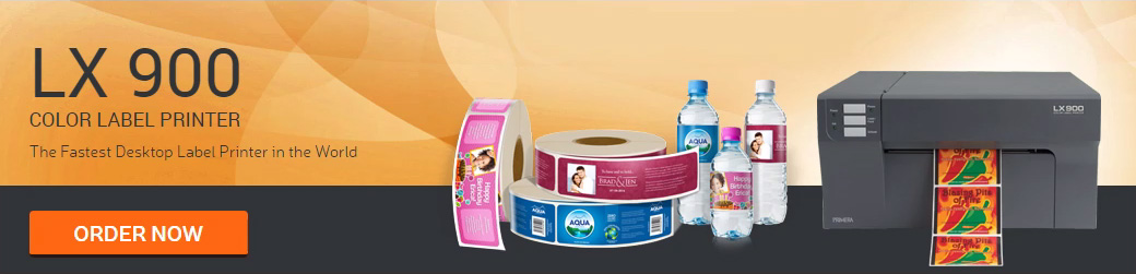
With color label printers, brands can take their marketing strategy into their own hands. Contact us today to learn more about our range of products.
 US Customers
 Follow us on facebook
 Follow us on twitter
 Follow us on linkedin
 Follow us on youtube
 Follow us on google+
 Pinterest
Leave a Reply